Typography in a game app is a field where little effort is spent. Most apps use the system default font, with no deliberate decision. Nothing wrong with that. But editorial typography in a game is a decision that changes the feel of the product. Sudoku BLA uses three fonts, each with a specific function. Worth understanding why.
The first is Literata. It is the font on the board numbers. Designed by Veronika Burian and José Scaglione (founders of TypeTogether) in 2015, commissioned by Google for book rendering in the Google Play Books app. It is a serif font, contemporary, optimized for prolonged on-screen reading. The choice for the Sudoku BLA board follows the same logic: you will look at the number for minutes, in expert puzzles for an hour. That kind of prolonged reading demands typography designed for it. Literata delivers.
The second is IBM Plex Mono. It is the font of the editorial eyebrow, that small band at the top of the app screens, written in caps, spaced out, like SUDOKU · DIFFICULTY. Designed by IBM’s design team in 2017, as part of IBM’s corporate design system. Monospace, medium weight, clear reading at small sizes. The choice of an editorial eyebrow in monospace is a conscious reference to journalism: cultural magazines and editorial newspapers have used that kind of font in small labels for decades. Sudoku BLA inherits that.
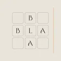
The third is Derina, a BLA-exclusive font, custom-designed. It appears only on the logo and in the BLA name. It is not available open source. It is a brand font, not a reading font. Its role is to keep the BLA logo from looking like any other generic-typography logo. It is the typographic equivalent of a signature.
Spacing decision. The Sudoku BLA board grid has generous spacing between cells, more than the standard of most apps. Each cell has room to breathe. The Literata number is centered, with a comfortable visual weight. A dense Sudoku, with small cells and cramped numbers, is tiring to read over a long session. The spacing decision was made with a one-hour session in mind, not a five-minute one.
Color decision. Answer numbers (filled by the player) appear in Tinta BLA (#2A2723), an editorial near-black that avoids pure black #000000 (which has aggressive contrast against the background). Clue numbers (already filled at the start) appear slightly lighter. Pencil marks appear in Sombra BLA (#8A8680), a discreet warm gray. This three-weight typographic hierarchy is one of the decisions that makes the Sudoku BLA board feel like a book page instead of an app screen.
Size decision. On iPhone, the cell number size is calibrated for normal reading distance (about 30 to 40cm). On iPad, the board scales but the number does not scale linearly: there is a sweet spot where more size starts to look childish, like a primary school primer. On Mac, it is similar, adjusted for monitor distance (about 50 to 70cm). Each platform has its own calibration.
Typography in a game app is a detail no one explicitly notices, but that defines the feel of use. Sudoku BLA uses editorial typography because BLA is an editorial studio. It is not an accidental decision. It is an expression of who built it. For the player, it is just pleasant to read. For the designer, it is one of the pieces that separates the app made with care from the app made in a hurry.